Here’s more information than you ever wanted to know about how text sizing and alignment work in Roblox. It’s one of the few parts of the engine that truly shows its age.
What are the units of text size?
They’re not points. They’re not even pixels - well, not the pixels you’re used to thinking of in CSS, anyway. It has nothing to do with the em square, or the cap height, or any rigorous typographic metric at all.
It’s based on the maximum height of all glyphs in the entire font.
Specifically, it’s based on yMin and yMax from the head table (assuming the font is in OTF format). When you set TextLabel.TextSize = 14, you are saying:
I would like the distance between
yMinandyMaxto be exactly 14 pixels.
This font sizing scheme was likely done for engineering convenience all the way back when UI fonts were first implemented (though the original original implementation before that used yet another sizing scheme - don’t ask, I’m scared too).
However, it’s an incredibly odd design when viewed from any other angle. Basing font size on glyph size not only places Roblox out of step with practically all other software, but it makes size between different fonts very inconsistent (which is why no other software does this).
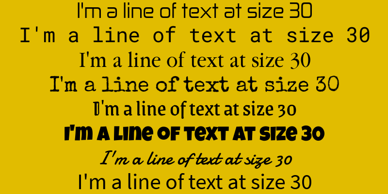
Text size is not the only casualty of this decision. You might already be able to see it.
Why isn’t my text aligned?
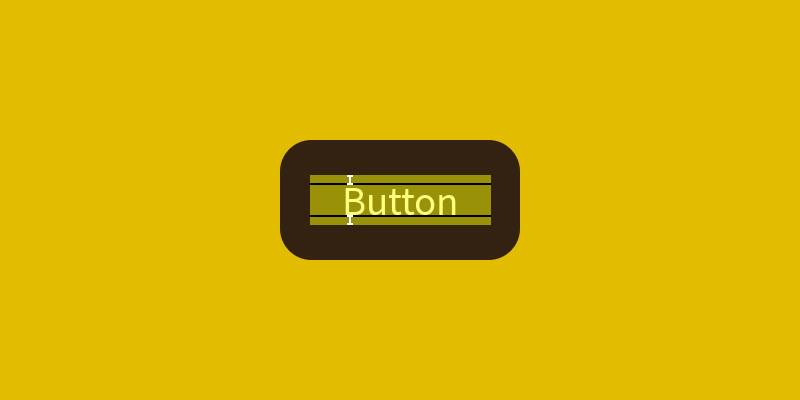
Have you ever tried to centre a text label while using the Luckiest Guy font?
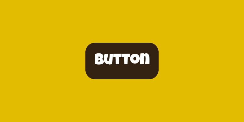
That is the default Roblox alignment. What, exactly, is the engine centring?
Drawing the TextBounds should shed some light on what’s going on.
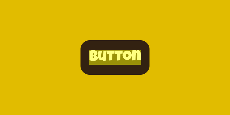
Roblox considers the yellow translucent box to be the bounds of this piece of text. It is centring this bounding box. But what is it a bounding box of?
Well, this box is exactly the same size, in pixels, as the TextSize of this label. 50 pixels, in this case. And if we remember what we learned about text sizing, it’s the distance between yMin and yMax - the maximum height between all glyphs in the font.
All of that is to say: Roblox aligns all text based on the maximum height of all glyphs in the font, too.
And also: This bounding box can be completely asymmetric.
This is really bad. It implies that, unless you hit the numeric jackpot, every text label on Roblox is vertically misaligned, at least by a little, and never in a consistent way you can compensate for.
Even Source Sans, the font used by Roblox Studio, and ogled at by creators for many hours a day.
Towards typographic metrics
So, what’s a more useful way of sizing fonts?
- Point sizes are unlikely to bring joy. They’re defined in terms of inches, and macOS has a different opinion about what one inch looks like compared to Windows. Plus, who even knows what ‘a point’ is anymore?
- CSS pixel sizes are at least consistent with the rest of the web, but they’re fundamentally based on the ‘em square’ - which is arbitrarily set by the font designer and is itself inconsistently sized and aligned relative to glyphs.
Instead, I think it’ll be more productive to go along with Roblox’s existing grain. Roblox is a platform that thinks in pixels, and it’s a platform that’s looking for a metric that better resembles the visual size and positioning of lines of text.
I propose using cap height to define the height of a line of text. That is, when you ask for a 16 pixel font size, it should make capital letters render 16 pixels high.
Cap height is a commonly used “consistent” metric across fonts, so there’s precedent for this. It’s even defined as part of the CSS spec as the ‘cap’ length unit, with a fully internationalised definition for handling cap height in non-Latin scripts.
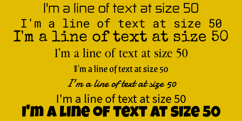
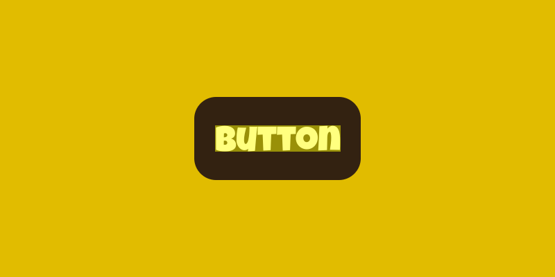
Here’s what our previous text looks like when rendered with 30 pixel high capitals. You can immediately see the size differences between fonts have been completely neutralised, with only the x-height beingly significantly different between the fonts. You can also see how much neater the lines are next to each other.
This is especially important when thinking about fallback fonts for internationalisation; if a section of text is written in a language the current font doesn’t support, the last thing you would want is to replace it with a font that looks completely differently sized.
Furthermore, Roblox should calculate text bounds based on the height of capital letters, not the maximum height of glyphs. This would solve the font alignment problem.
So there. Now you know too much about Roblox typography :)