
visionOS is the first mainstream OS to ditch square check boxes, and the nerdy part of the internet is on fire. I wanted to weigh in.
A note on the past
I’m a young (22y/o) designer. I grew up with Windows XP, so I’ve little personal affection for designs that came before it. I’ve never read or even really heard of that IBM design document thing that everyone’s raving about.
A lot of the voices in the current discourse talk about the 90s as being a golden era of UI design. Look - the buttons are 3D and ultra pressable! The scrollbars are chunky! You can actually tell what’s interactive, and everything’s packed in with appropriate efficiency for a mouse cursor to navigate.
As much as I appreciate this sentiment, and agree that it is good for UI to have affordances and use space efficiently, I partially dismiss the sentiment of “the past was always better” as rose-tinted glasses. I’ve seen a fair few examples of old-timey apps which don’t do these things. Heck, Microsoft Office, an official Microsoft product from the time, had plenty of buttons without borders, as a prime counterexample to one of the most commonly touted “things we lost”.
As such, this post will contain very little glorification of the past. As far as I’m concerned, better and worse designs - for whatever metric of ‘good-ness’ you choose - have always existed and will continue to always exist. I want to evaluate designs based on their merits today, not what was in vogue yesterday.
Okay, let’s talk design.
The criteria
I’m going to measure different designs based on certain criteria, in a totally subjective, personal-opinion, disagree-with-me way. I’ll make sure I’m not designing them ultra-minimalist, and including a reasonable baseline of detail - the amount I’d expect from a decently designed OS vendor.
Affordance: How well does this design communicate that it’s clickable? Does it communicate the extent of its hitbox well? Is the user drawn to interact with it in a certain way, and are all usages clearly communicated?
Legibility: Does this design stand out against its background? Is it easy to read the current state of the design? Does it depend heavily on factors that might disadvantage those with vision impairments?
Predictability: Can you tell what the design does just by looking at it? Does it communicate grouping or mutual exclusivity well? Can you predict the result of clicking it ahead of time?
Ergonomics: Does this design use space well? How much mouse movement does the design imply, and how much is required for it to work?
Radio button designs
I’m going to start here, because it’s less controversial. Each design is going to be given a catchy one-word name so I can refer to them easily. Don’t take the names too seriously.
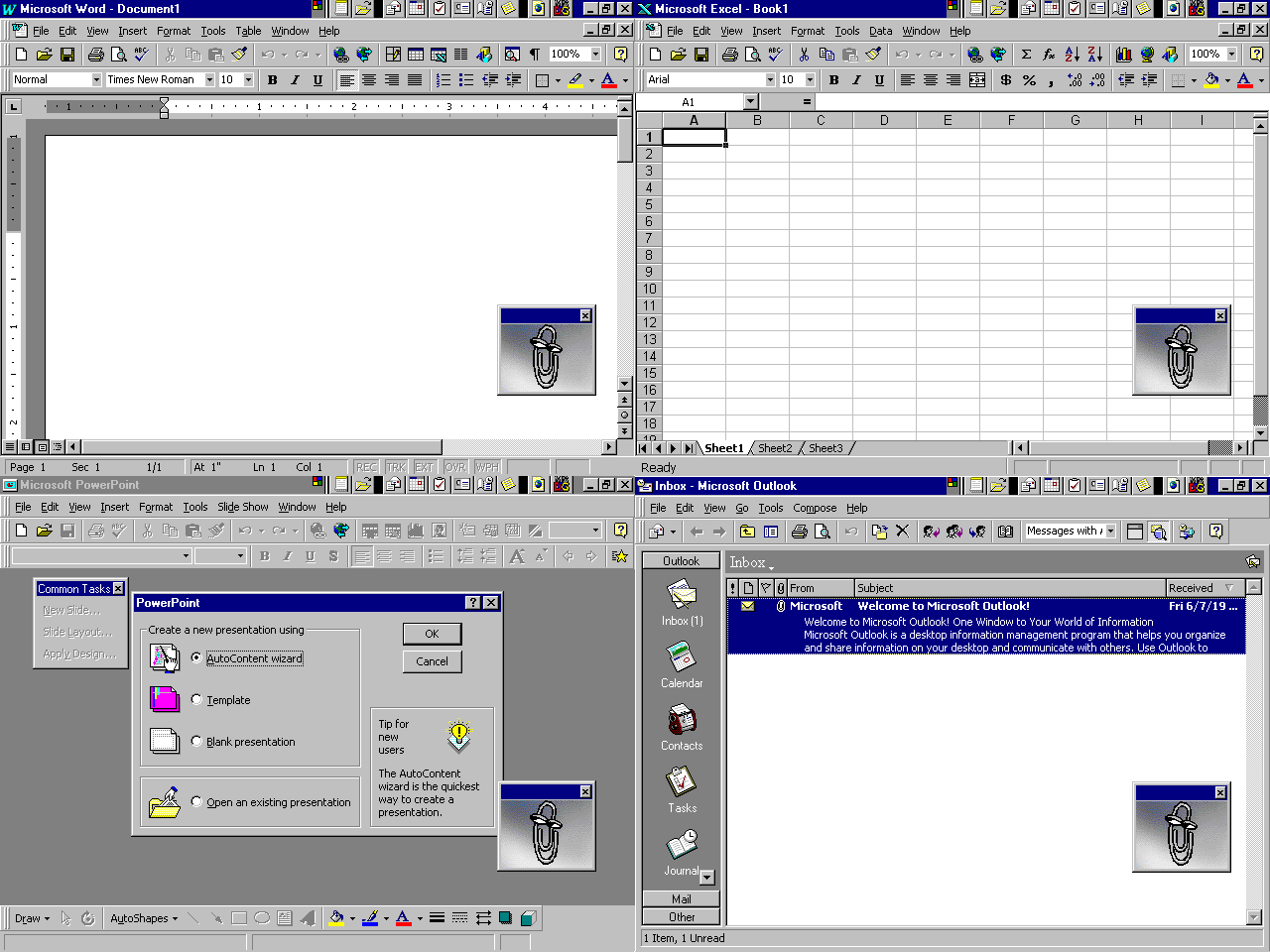
Design 1: Tradition
I have a few notes here.
Firstly, this setup expects options to be spatially grouped together to imply connection. I don’t like this - implied connection can sometimes be unintuitive for new users, and can also sometimes be ambiguous if the layout is particularly bad, or if it has multiple columns. I know some older UIs would bound some radio buttons with a grouping outline, which helps to delimit the space, but I would prefer something a little more local to the controls themselves.
Also, I have some notes about the way these are commonly styled. The empty state is quite similar in colour to the background, which often just leaves the unfilled stroke as the only visibly contrasting element. I also don’t like this, and I would prefer if there were some element to show the empty radio buttons more clearly against the background. This is doubly true if you end up in the (traditionally unidiomatic) state of having all radio buttons unfilled, though actually I’d probably disagree that it’s truly a bad idea to do that. I think it can be a good thing to require a user to explicitly answer, to make sure they don’t accidentally skip over a field in a way that won’t be caught when they go to submit.
I also don’t think this ‘paper form’ style does a particularly good job of providing enough affordance. The empty state doesn’t look particularly clickable, nor does it tell you a lot about whether it’s enabled or disabled (usually they’re just greyed out, which ironically makes them more visible most times, because of the white fill). Many implementations also let you click the label to flip between options, which is not communicated at all, which hampers the ergonomics because less experienced users will find themselves trying to hit a tiny target even though they don’t technically have to.
I think the skeuomorphism of basing this design on similar ‘paper forms’ is okay. For people who understand the connection, it can be a decent metric. However, I would also estimate that a lot of people won’t understand this, especially now that we’ve moved beyond form-like UIs into much less paper-like layouts and content. We’ve largely moved on from submit-style UIs into a more reactive world, so I think the connection is obscured. The content of the labels probably does more to enforce the mutual exclusivity than the shape does, particularly for the younger generations who will have primarily interacted with mobile UI, which is even less form-like.
Overall, it’s certainly what we use now, but it’s far from a clear winner.
- Affordance: Mixed
- Legibility: Poor
- Predictability: Mixed
- Ergonomics: Good
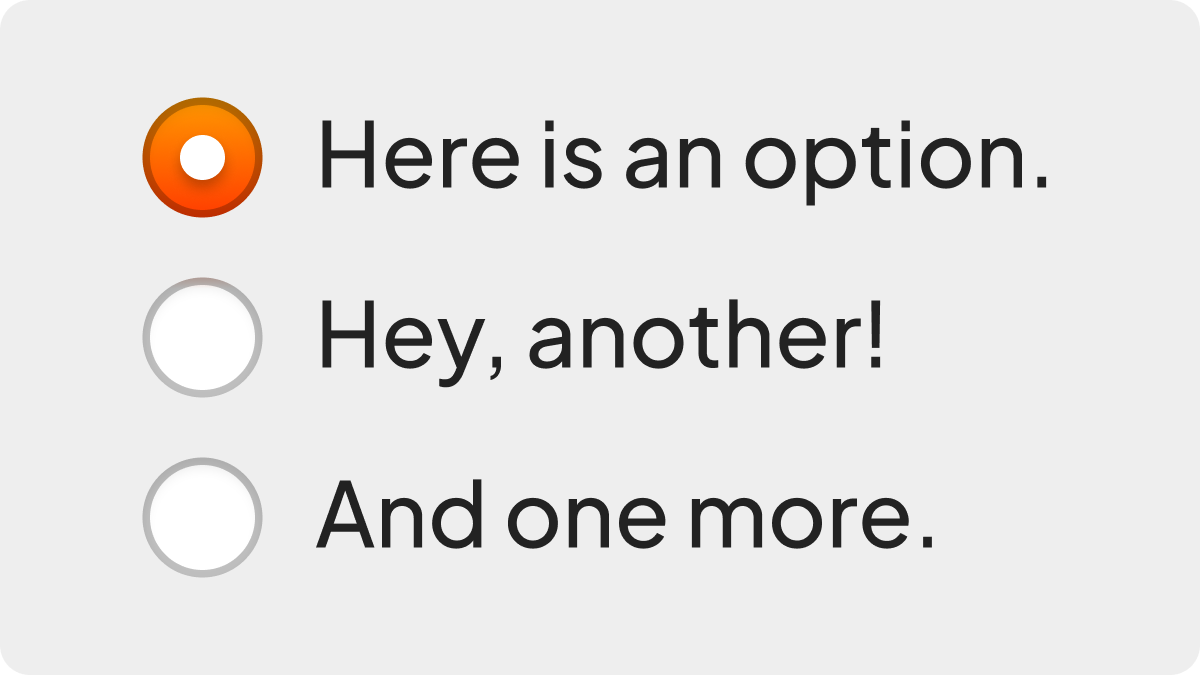
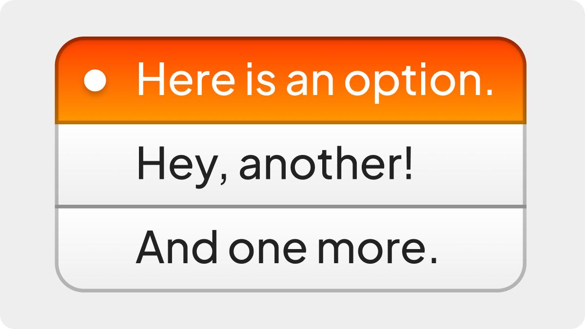
Design 2: Connected
Someone suggested that the radio buttons should be more visibly connected. I agree with this sentiment, and actually, I think this looks much better than Tradition does.
This design does a great job of directly and explicitly showing the relationship between the various options. It seems intuitive that the state flows between them, rather than each option having its own independent state. You can almost imagine that white pip flowing between the different bodies of the buttons.
I think it regains a little bit on the affordance. It’s still somewhat dependent on knowing that it’s mimicking a physical form, but if you didn’t know, you might have an easier time understanding how it operates just from first glance. If you’d woken up having forgotten all of your form knowledge, you’d be less lost here.
I’m not sure how this would work with multiple-column radio button groups though, so I’m going to dock points for ergonomics because it might end up being space inefficient.
- Affordance: Mixed to Good
- Legibility: Poor
- Predictability: Great
- Ergonomics: Mixed to Good
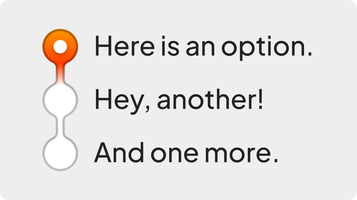
Design 3: Slider
Let’s try a design that strays from the ‘paper form’ skeuomorphism of Tradition and Connected. I saw this one suggested somewhere too.
I think this is much more intuitive than the prior designs; sliders are more fundamental and physical of a skeuomorphism than forms are. Especially with the inclusion of the dragging affordance on the slider head, it seems like it would be incredibly compelling to drag.
That’s where it takes a step back in ergonomics though. It’s too compelling to drag in some sense. I don’t think any single-click feature would be particularly discoverable, so you might just end up with a bunch of people dragging their mouse cursor with zero clue that there would be a more efficient way.
Legibility is alright. The main problem I can foresee is that slider track becoming too transparent because a designer thought it’d look sexy or whatever.
Also; see last point about multi-column layouts.
- Affordance: Great
- Legibility: Good
- Predictability: Great
- Ergonomics: Mixed to Poor
Design 4: Buttons
This is probably what I would do as a designer from the ‘new generation’. From what little I’ve overheard about car radios in these discussions, it perhaps mimics actual ‘radio buttons’ a bit more closely.
So long as you’re actually putting backplates on your buttons, I think this is probably one of the best ways of communicating the hit region. Presented with this design, I think newer users would strain less because it’s immediately obvious there’s a huge space for the cursor to land on, which should make them feel more comfortable.
I think it’s important that the buttons look related, so I glued them together and made them share the corner rounding as a group. This might be missed or ignored, so I’m docking affordance points for that, but otherwise it’s really good as far as I’m concerned. There are variants of this design that envision the fill background as a sliding object that moves between options, rather than having discrete buttons, but I think it’s trading blows as far as looks go.
I also tried to emphasise the currently active option by making it look inset. I preserved the familiar pip on the left side, just as a nod to the current design, but I could easily see this being swapped out for more descriptive icons.
Using buttons like this might take up more pixels, but you might also save pixels if you wanted to include icons. I think it’s a pretty equivalent trade. I’ll put it down as ‘good’ rather than ‘great’ just to indicate that you might lose a touch of space efficiency if the UI is particularly dense, but I don’t think it’s that bad. Honestly, I prefer a little more room in my UI - it’s easier to parse and less distracting, but I won’t speak for everyone.
- Affordance: Good
- Legibility: Great
- Predictability: Great
- Ergonomics: Good
I think it’s pretty clear who won my heart in this battle.
As far as I’m concerned, Tradition is a pretty bad design. Connected has mostly all of the upsides of Tradition, with the only real drawback being the multi-column layout. Slider is alright too, I suppose, but perhaps a bit unconventional.
I’d probably just stick with Buttons if you’re reaching for a mutually exclusive control group for a handful of options. It’s more inclusive by not depending on a ‘paper form’ skeuomorphism that is less common on mobile, and overall communicates its function and hit region better. Feel free to disagree with that take if you’re not into it.
Check box designs
Okay, that last round was less spicy. Let’s kick the wasp’s nest and get to the heart of the debate.
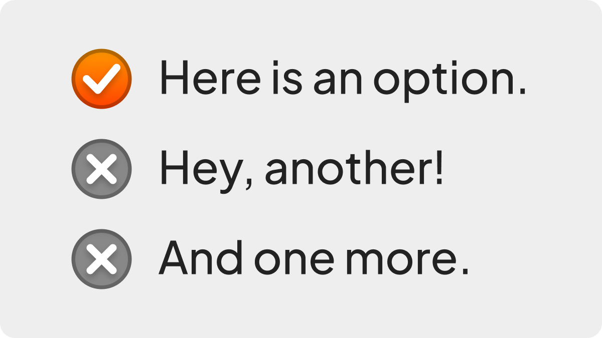
Design 1: Tradition
The fan favourite design returns, but it suffers much the same as Tradition did with radio buttons.
I’m pretty sure the waters have been sufficiently muddied in the world of web and mobile design at this point that the distinction between squares and circles is meaningless now. The distinction mainly worked when it was reliable, but I feel like it’s now more conveyed by context. At the very least, I think this design is a little more predictable, because there’s no implied connection anymore.
The point about the legibility of the unfilled state is extra pertinent here. It’s entirely reasonable, and in fact common, for a set of check boxes to be all unfilled. This could have serious implications for contrast against the background.
Overall, I’m still not overly impressed.
- Affordance: Mixed
- Legibility: Poor
- Predictability: Good
- Ergonomics: Good
Design 2: Modernity
Ah yes. It’s Tradition but even worse now, because you can’t tell the difference between a check box and a radio button. It’s literally no better - predictability has tanked.
- Affordance: Mixed
- Legibility: Poor
- Predictability: Poor
- Ergonomics: Good
Design 3: Switch
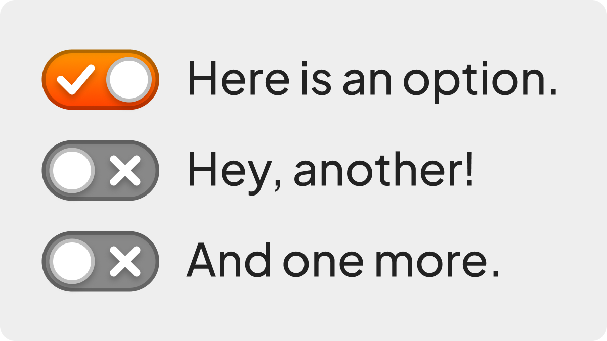
People on the internet love to clown on toggle switches, but I’m not really convinced.
The common argument is that toggles imply reactivity, and that non-reactive use cases such as submitting a form, or conditions such as filters during an advanced search, should use check boxes instead. Hot take: I think this is niche. I think the expectation of reactivity is much more prevalently communicated by the stuff that’s around these controls. If something’s going to live update, you probably already have a sense of that from the UI as a whole. So I’m not going to mark based on this, because I think - especially with the mobile generation expecting reactive designs by default due to mobile trends - that this is a non-issue.
The legibility of these designs, though? They are fantastic. Like, chef kiss level fantastic. It’s so clear and obvious! The backgrounds stand out! Each state has an easily readable icon! I read one commenter who liked how the double-wide design makes it look like there’s two columns, the ‘on’ column and the ‘off’ column. Reminiscing on my own usage patterns, I realise that’s how I read these too. If you want a legible design, this is the direction to go; it pulls out all of the stops.
Switches are very predictable as a design, and the ergonomics are better because they’re a larger hit target compared to your typical check box. They don’t necessarily have to be less space efficient - you can get away with it being just slightly wider than a check box at the same height - but I will say that they heavily imply a dragging motion, so I’ll at least dock points for that. In fairness, it’s not quite as large of a distance as the slider was.
- Affordance: Great
- Legibility: Great
- Predictability: Great
- Ergonomics: Good
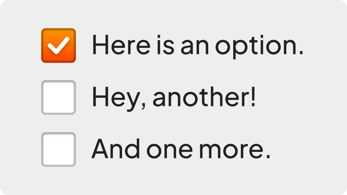
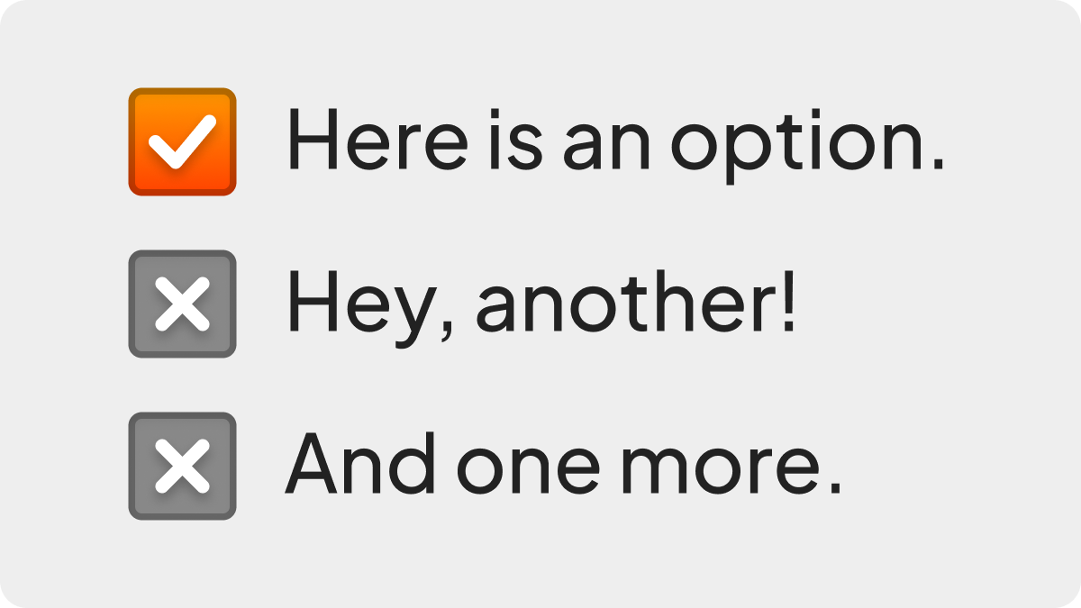
Design 4: Modernity Plus
If we take our learnings from Switch and apply them to Modernity, does it fix all of the problems? Kiiiiiiiiiind of.
Legibility has taken a huge jump here; the unfilled states are much more contrasting with the background. It’s also better distinguished from the Tradition radio button design. However, there’s a slight ambiguity - the ‘x’ looks a little bit like a close, delete or dismiss option. This could easily be confused for ‘chips’ like you’d get in a filtering UI, so I’m docking points for that.
Overall though? It works better.
- Affordance: Good
- Legibility: Great
- Predictability: Mixed
- Ergonomics: Good
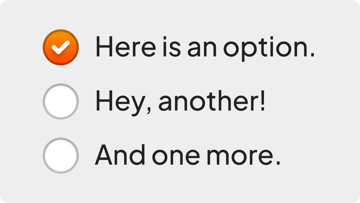
Design 5: Tradition Plus
If we give Tradition the same treatment, you get way better legibility, but not much else changes. As before with Modernity Plus, it looks a little too ‘close-buttony’ for me to have unfiltered enthusiasm for it.
- Affordance: Mixed
- Legibility: Great
- Predictability: Mixed
- Ergonomics: Good
Design 6: Buttons
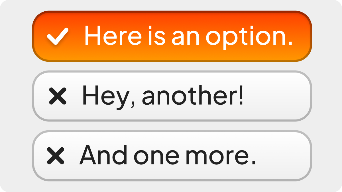
Buttons did really well in the radio button round, but here it’s a little less of a clear victory.
While it’s true that the hit region is again spectacularly well outlined, it still feels a little bit too “close-buttony”. I’m still docking points for the spatial grouping not necessarily being particularly noticeable or understandably significant - if you were to mix both the Buttons radio group design and this Buttons check box design, you’d probably run into confusion from users.
I think it’s probably good for some contexts, but I’m not enamoured this time around.
- Affordance: Good
- Legibility: Great
- Predictability: Mixed to Good
- Ergonomics: Great
So… where does that leave the coveted, beloved square check box? Unfortunately, it might be over.
For all the switch hatred on the internet, I genuinely think it might be the strongest contender here. It’s most visible, a great affordance for the action of toggling, least likely to be confused with a close or dismiss style action, and has strong parallels in mobile design where they’re ubiquitous. The only downside is the whole advice about “use checkboxes for conditions or submitting forms”, but I honestly think that doesn’t matter, and that the intuitive aspect of their design is probably more important as we move into a young person’s world.
You can remedy some of the issues with Modernity Plus or Tradition Plus, but ultimately, I just don’t think there’s much saving these designs. I think it’s time to let go of them in favour of more clearly distinct designs that have zero opportunity of getting confused for another type of control.
I think that Buttons has the chance to work in some situations, but I don’t think it’s really something I could generally recommend.
Conclusions
So, were Apple wrong to ditch the square check box in visionOS? I think that’s the wrong question.
The question is: should we have check boxes at all? The vogue opinion in design circles right now seems to be “yes, and there’s specific times you should use them over toggles”. I question this; the distinction has always seemed more than a little arbitrary to me, but I nonetheless have historically followed this advice without questioning it too much. However, on reflection I realise that’s actually led me to more substantial issues with legibility and contrast of unfilled states, which wasn’t worth it. I’m switching (ha, pun) over to toggles full time in my personal work, and I’m not going to look back.
As for radio buttons? I think at minimum we should be doing more to imply their relationship. Connecting them with a tube is a good minimal change to make, but if it were up to me, I’d try and more fully realise them as a connected group of buttons.
Of course, all of this was my opinion, and there’s probably a good chunk of people out there ready to set my house on fire.
Please don’t - rent’s really expensive in this housing market.