
Graphics designers love massive landing pages and huge typography. Here’s how to ensure it’s maximally accessible to users of all screen shapes.
How not to do it
Rasmus Andersson’s landing page for Inter is beautifully designed. Here it is at 16:9, the aspect ratio it was probably designed for.

Perhaps luckily for a web page advertising a font, if you’re an ultrawide user, you’ll certainly have space to appreciate the intricacies of the typography.
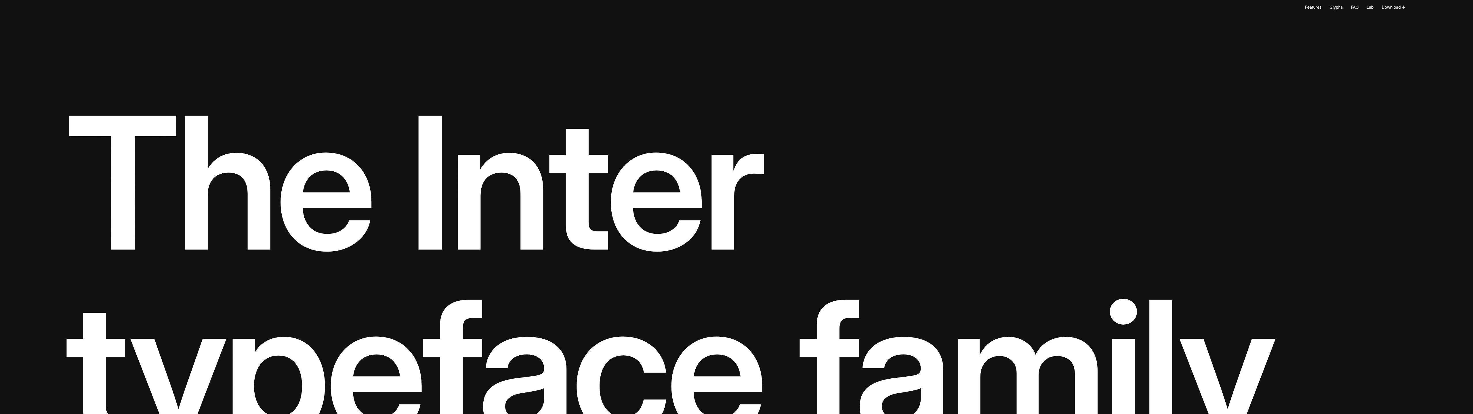
We can all agree this isn’t good, right?
What I’m doing
I write this post because I’m working on my personal website right now. I want one of those big flashy landing pages, too. (Don’t worry, it’s just the one page, as a treat!)
At 4:3, the page looks pretty standard. Most websites don’t struggle with this aspect ratio.

However, if you blow up your viewport’s width to 21:9 you’ll notice everything remains on-screen. This is not a given with these sorts of web designs.

You can go even further, too. Here’s 32:9, because that’s the age we live in.

My golden rule is this: once you’ve chosen what should be above the fold at the resolution you’ve designed for, increasing the width should never push those things below the fold. There’s some nuance to that statement implicitly; for example, if you’re narrowing the width, then that’s a different story. But generally, I should not be disadvantaged as an ultrawide user, when compared to someone using a screen of normal width. At minimum, you should clamp the aspect ratio so I get the same 16:9 experience centred to my ultrawide. At best, you should consider making your website design responsive to both the viewport width and height simultaneously.
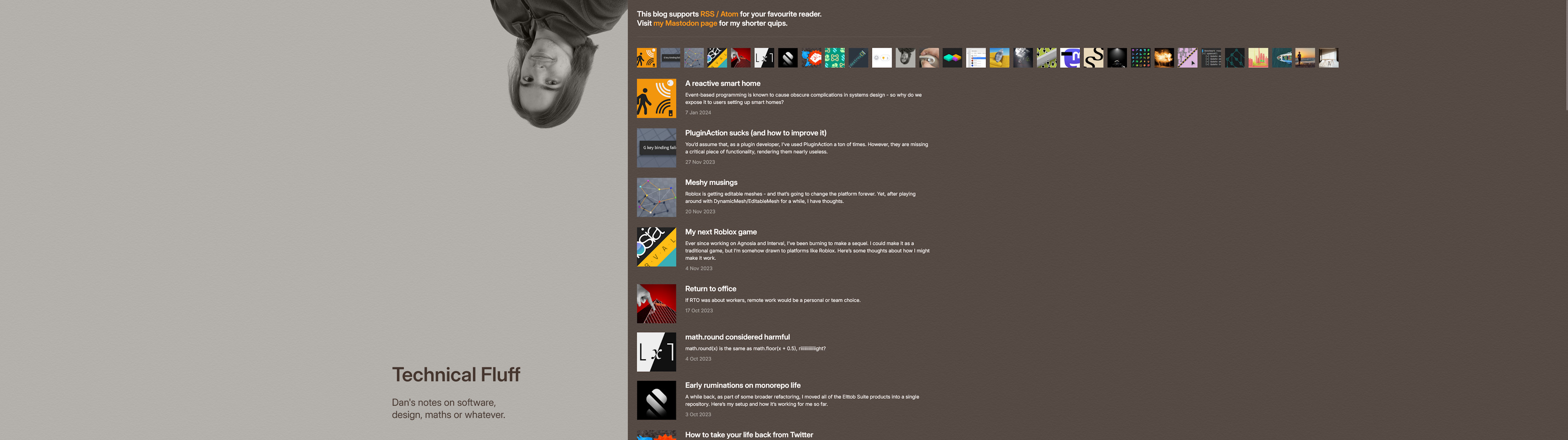
I always test my websites at ultrawide resolution, and sometimes I even have bespoke wide layouts for them. Notably, I do this for Technical Fluff, which places the title on the left at wide resolutions, and allows for any horizontally scrolling elements to freely flow off to the right, rather than mandating a limited-width scrolling window.
Testing your websites at ultrawide resolution is also a good idea. I would recommend it, too. Remember: there is no “desktop” resolution or “mobile” resolution you should aim to support. Any resolution is a possible valid one, and that extends to aspect ratio.