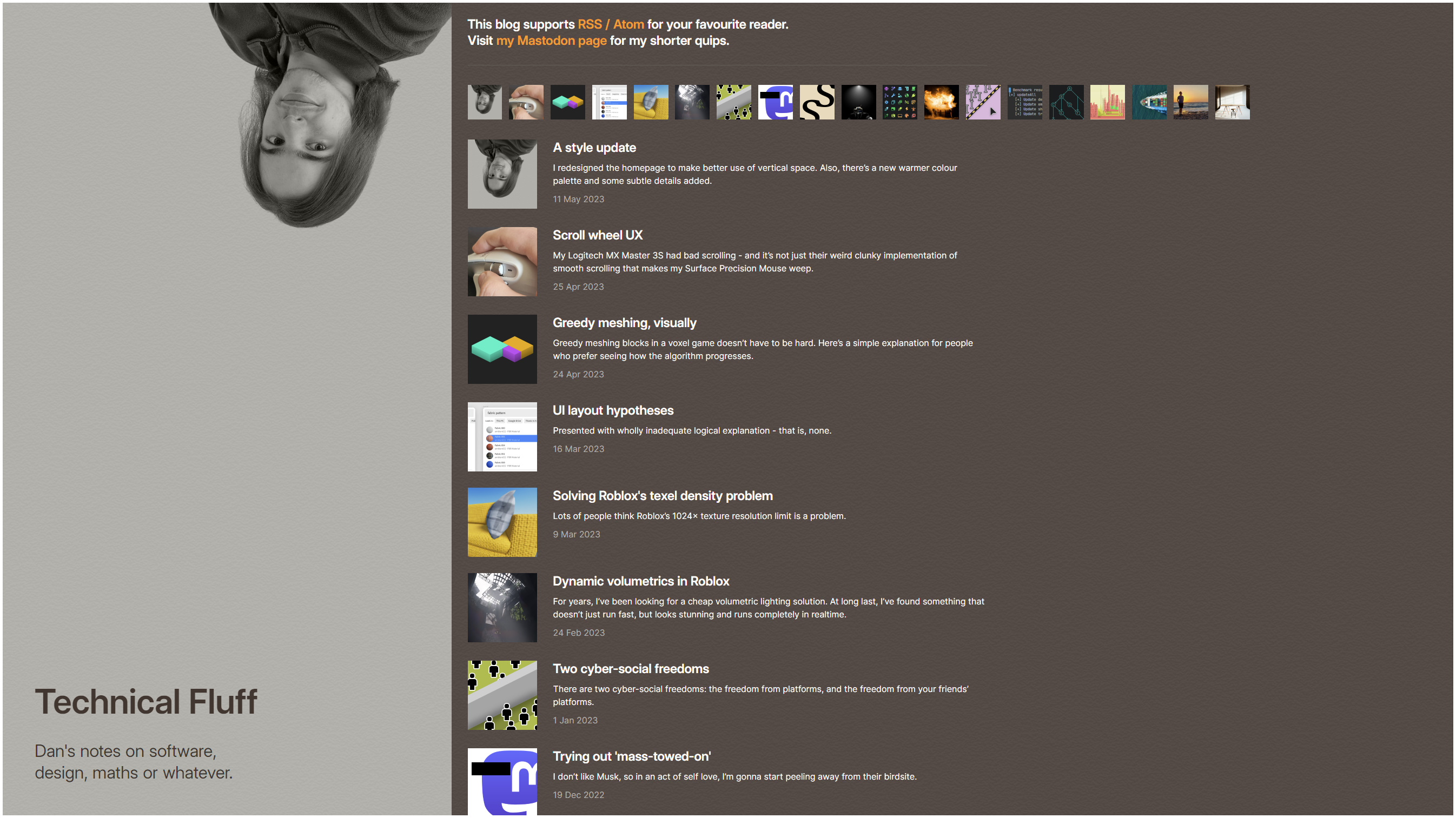
I redesigned the homepage to make better use of vertical space. Also, there’s a new warmer colour palette and some subtle details added.

First thing I did was to update my photo at the top of the page. When I first set this place up, it was just cropped out of a photo I randomly took in San Francisco (while I was rooming with Trey at RDC). This one, if you’re curious:

Flattering, quite frankly. A fantastic face for the home page. Not awkward at all. Anyway, my hair is longer now, so I took a better photo, and now it’s nice and big on the home page.
While I was there, I thought the header took up a lot of space vertically, which is bad because you want to be able to see as many blog posts right away, so you don’t need to scroll as much. So I did a lot of pretty tricky responsive design stuff and managed to nicely get it all to show on the left side for sufficiently large displays. It tries to keep the blog list in the centre of the screen so you can read more comfortably without looking towards the side, and of course it intelligently adapts to ultrawide screens too, allowing for extra space to be added on the sides so the content remains reasonably central.
I added some more prominent links to the RSS feed and to my Mastodon page at the top, which should make them more discoverable. I also added a horizontal thumbnail strip so you can quickly go backwards in time and find old blog posts if you know what you’re looking for. If you have a wide monitor, it’s allowed to go beyond the normal line length limit so it’s not cut off when there’s free space to the right that it can take up instead.
Finally, I swapped out my cool greys and blues for something warmer, cosier and a bit nicer to read text with. Oh, and the site has a favicon now. I’m overall pretty happy with everything.
The article pages themselves haven’t changed much apart from colour and style consistency tweaks. I might update them down the line, but they’re OK for now.
Let me know if anything breaks horrendously, and I’ll fix it at some point.
