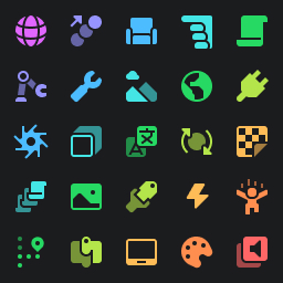
Vanilla 3 did a lot of work on icon consistency. However, a remaining issue was that I still had no system supporting the choice of colours for icons.
Systems are important in design. They help us to make informed, principled and logical decisions that are likely to meet what end users want and need, without having to waste tons of time re-analysing the same problems.
Up until now, I haven’t had a system for choosing colours in Vanilla; instead, I would simply pick the colour I ‘feel good about’ as a designer. I had vague, fuzzy principles in my head, of course, such as:
- Important icons that people need to find should not blend in
- Instances related to each other should have consistent and transferable colour categorisation
- For some icons, it’s important to preserve their original colours, because the colours have become part of their identifying features
The only thing that comes close to a rigorous system is the colour palette that I drew from for the icons, which was intentionally restricted heavily to a few key colours to try and make the icons feel cohesively designed. Ultimately, though, this method of colouring icons did suffer from more inconsistency and ‘noisiness’ than I would prefer.
That’s why I’ve set out to codify all of my colour choices for Vanilla, by developing a general framework for icon colour categorisation based on how real people label and prioritise the instances they work with.
A system of tags
The core idea underpinning all this categorisation work is that people associate icons with ideas, in a way that somewhat resembles a prioritised list of tags.
For example, many people might think of PointLight as a “light source” most importantly, then a “lighting object” with less importance, an “adornment” with even less importance, and so on. A PointLight is all of those things, and so you could make a reasonable argument for colouring it based on any of those tags.
However, it should be clear that some groupings are less helpful than others. If we considered a PointLight to be in the ‘Adornment’ category alongside something like a ProximityPrompt, we might be painting with too broad brushstrokes to have any useful colour categories at the end. It’s clear, then, that some tags are more important to represent with colour than others - we want to colour our PointLight based on the fact it’s a light source, not an adornment. That doesn’t necessarily mean these priorities are global, though; it might be more relevant that a BoxHandleAdornment is an adornment, for example, and so the priorities of different tags are inevitably dependent on the icon they’re tagging.
To implement this in my system, I assign every icon an array of string tags. These string tags are meant to represent ‘ideas’ at a medium level of granularity. Their order represents the importance of the tag to the final colour of the icon, with the most relevant tags at the start of the array.
These tags are stored in a tags.json file, and taken as an input into my icon
compilation process. This is an example of what it might look like:
{
	"tags": {
		"general": {
			"Toolbox": ["Insert"],
			"Part_Block": ["Insert", "Part"],
			"Part_Sphere": ["Insert", "Part"],
			"Part_Wedge": ["Insert", "Part"],
			"Part_CornerWedge": ["Insert", "Part"],
			"Part_Cylinder": ["Insert", "Part"],
			"UI": ["Insert", "UI"],

			"Material": ["Edit", "Material"],
			"Color": ["Edit", "Colour"],
			"Group": ["Edit", "Group"],
			"Ungroup": ["Edit", "Group"],
			"Lock": ["Edit", "Lock"],
			"Unlock": ["Edit", "Lock"],
			"Anchor": ["Edit", "Anchor"],

			"Play": ["Simulation", "Play", "Avatar"],
			"PlayHere": ["Simulation", "Play", "Avatar"],
			"Run": ["Simulation", "Play", "Server"],
			"Resume": ["Simulation", "Play", "Pause"],
			"Pause": ["Simulation", "Pause"],
			"Stop": ["Simulation", "Stop"],

			"GameSettings": ["Settings", "Game"],

			"TeamTest": ["Multiplayer", "Simulation", "Play", "Avatar"],
			"ExitGame": ["Multiplayer", "Simulation", "Stop"]
		}
	}
}
This already gives us two semantic axes to play with for any given icon:
- by choosing which tags are present in the array, we decide what ideas it is meaningfully related to, without having to weigh up its relative importance
- by choosing whether a tag should appear before or after another tag, we decide which tag is more important to represent with the icon’s colour, without having to consider the actual colouring process
These axes of customisation are powerful; they allow us to scope discussions about icon colours effectively, and they give us a framework for implementing user feedback without breaking the entire organisational structure.
If users don’t like the icon colouring, we can look at the tag prioritisation and identify which ones we mistakenly over-prioritised, then simply rearrange them to better match what we believe the users actually prioritise. We can also add additional tags to represent ideas we didn’t previously identify, but which seem significant enough to warrant inclusion.
This process will naturally culminate in a new set of final colours that’s still categorised in a way conducive to learning and understanding, but which draws the lines slightly differently to match the feedback you needed to address.
A quick aside: on outliers
Something interesting that both myself and Roblox’s own icon designers observed is the need for some icons to stand out, regardless of other broad categories that they might fit into. For example, you always want folders to be folder coloured, even if you’re using some other colour to represent the ‘container’ category or whatever category it broadly would fall into.
In my mind, icons that deserve their own colours aren’t actually outliers. They
simply belong to a category all on their own. It’s a valid category, because it
is an attribute which users find highly valuable to identify, and so under this
system it is perfectly legitimate. That’s why, for something like a folder, you
would probably see a list of tags like ["Folder", "Container"] - it is more
important to represent it as a folder than as a general container.
Assigning colours
Now that we know what tags exist in the system, we can now assign colours to those tags. Every tag is given a colour, irrespective of how much importance it was assigned previously.
These colours will essentially become the visual representation of different ideas, and serves to encode some existing practices we already do, for example using green to represent server stuff, blue for client stuff, purple for functions, yellow for events, etc.
I don’t prescribe any specific way of assigning colours here. I personally like to draw my colours from a palette, since we’re going to be dealing with potentially hundreds of tags, but you can pick unique colours for each if you prefer having that kind of granularity. Of course, a consideration to make if you’re drawing from a palette is that lots of tags will end up with the same colour assigned. It’s a good idea to think about which tags share which colours, based on whether it would cause confusion in the places where they primarily show up in the UI.
In my compilation process, I store these tag-to-colour mappings as part of my
existing palette.json files, inside of a tag_colours key. It might look
something like this:
{
	"tag_colours": {
		"Replicated": "red",
		"Negative CSG": "red",
		"Video": "red",
		"Model": "red",
		"Audio": "red",
		"Avatar": "orange",
		"Edit": "orange",
		"Lighting": "yellow",
		"Event": "yellow",
		"UI Frame": "yellow",
		"Folder": "yellow",
		"Package": "yellow",
		"VFX": "yellow",
		"Texture": "yellow",
		"Clipboard": "yellow",
		"Insert": "yellow",
		"Test": "lime",
		"Debug": "lime",
		"Physics": "lime"
	}
}
This should be pretty self explanatory. What I like about this is that, like before, it allows criticism to be directed at a specific layer of the process and easily changed. If you hear from users that it’s weird to colour avatar icons orange, for example, then you can easily change it to another colour and the rest of the system will naturally respond to that. Importantly, it (mostly) decouples colour from semantic meaning and grouping, so you can feel confident that making colour changes here will not destroy your user’s mental model of how icons are associated with each other (with the notable exception of tags sharing colours causing groups to seemingly ‘merge’ - be careful).
Now we have icons with prioritised and coloured tags. The final colouring process is simple and automatic; simply choose the highest priority tag for each icon, and adopt the colour of that tag. This naturally groups related icons into the same colour category. If you’re feeling creative, you could perhaps do some more sophisticated colouring here, like using the other tags to colour secondary icon layers, or even blending tag colours together for more interesting results. I’m not personally exploring these avenues.
Early results
I’m still working on the compiler infrastructure to fully support all of this work. In the meantime, I’ve been trialling most of these ideas by producing preliminary icon packs using some rough tags I drafted together, and a slightly extended version of the Colourful palette including some more intermediate hues such as orange, teal and indigo.
These early results are very positive, yielding a more cohesive-feeling Studio experience with icons that are highly readable and distinguishable, while also simultaneously falling into more clearly delineated and memorable categories.
I made a few interesting observations while looking at the Insert Object pane. Firstly, some categories are more homogeneous than others; the Physics and Scripting categories are good to contrast with each other. I believe this reflects how physics instances are more fungible in users’ minds when compared to scripting instances. With scripting instances, you’re often building deep and wide hierarchies from the same handful of instances, so every single one needs to be easy to pick out. On the other hand, physics instances are often used in a much more limited capacity, with only a few being picked out, and not often being nested or otherwise taking up much screen space. They exist as part of a larger hierarchy of instances from other categories, and so the specific details of which physics instances are being used matter less - it’s more important to just be able to locate the physics stuff generally. In some sense, you’re looking for a uniform density of colours in the explorer pane, even if that’s at the expense of non-uniform density of colour within the Insert Object pane.
A second observation is that colouring icons from first principles like this can actually expose other organisational shortcomings, by showing it up as colour noise. Look at the ‘3D Interfaces’ section, and you’ll see that lots of colour shows up there even though it seems like it should have been a homogeneous section. Look closer and you’ll see it actually contains a lot of things that aren’t interfaces - the section is badly organised, and that manifests as visual clumsiness. I think this actually puts forward a strong case for using semantic icon colouring systems as a tool for detecting other architectural failings in your UI’s layout.
One of the things I was actually pretty surprised by is just how close the explorer colours look to regular Vanilla 3 in the most common places. Of course, some icons bear different colours, but I do think this speaks to the fact that Vanilla 3 already does a decently principled job where it matters most. I’ve been using this early icon pack for weeks now, and I’ve never struggled to find any instance I was looking for. It’s really great to use.
I’ve also been enjoying my experiments with the ribbon bar. For ribbon bar icons I’m currently experimenting with prioritising some slightly more general tags, such as ‘Insert’, ‘Edit’ and ‘Clipboard’, over more specific tags like ‘Lock’, ‘Group’ or ‘Part’. This naturally leads to pretty good section colouring, which I think strikes a nice balance between being able to identify icons, and not creating a visual potpourri at the top of the screen. It also makes it easier to mentally group icons together and predict where buttons will be if you haven’t memorised their location. Like before though, this also tends to highlight places in Studio which are organised poorly with colour noise.
Future work
I’m still heavily refining my tags. I’m still working on the Vanilla compiler to support this workflow. I want to put together some software that’ll help me visualise all of this data and keep it consistent.
Something else I want to do though is exchange notes with the Studio design team. I really love that they’re dedicated to making Studio feel more modern, and they’ve served to inspire some of my thoughts about colour. However, I’m not sure how much they’ve been able to capture what users actually want; that much seems evident from the level of backlash the new icons have gotten every single time they’ve been deployed.
I want to see them succeed. I’ve been talking with them for a while now about ideas for how they could move their icon set in a good direction. They do have reasons behind the design decisions they’ve made, though I can’t say I agree with all of them. Some of that is personal taste, though.
I think what they need help with is figuring out what’s important. Their first attempt at icons prioritised consistency to the extent of painting icons too broadly. Their second attempt at icons prioritised giving icons their own colours, but I feel there wasn’t much of an overarching principle to it, nor do I think it was entirely effective. To be honest though, Vanilla 3 is a bit like that, too.
For the time being, I hope this can help inspire their next moves with the icon set. I think there’s value in codifying and separating out the semantics of how users think about icons, and using only those semantics to decide icon colours. Perhaps when I feel like my own tags and categories are in a good place, I could publish my data files for reference.
That’s a way off though.